Product configuration: Basic information
The Basic Information section covers the foundational details of your product: its name, description, imagery, developer information, and branding. To access these settings, navigate to your product and click Edit.
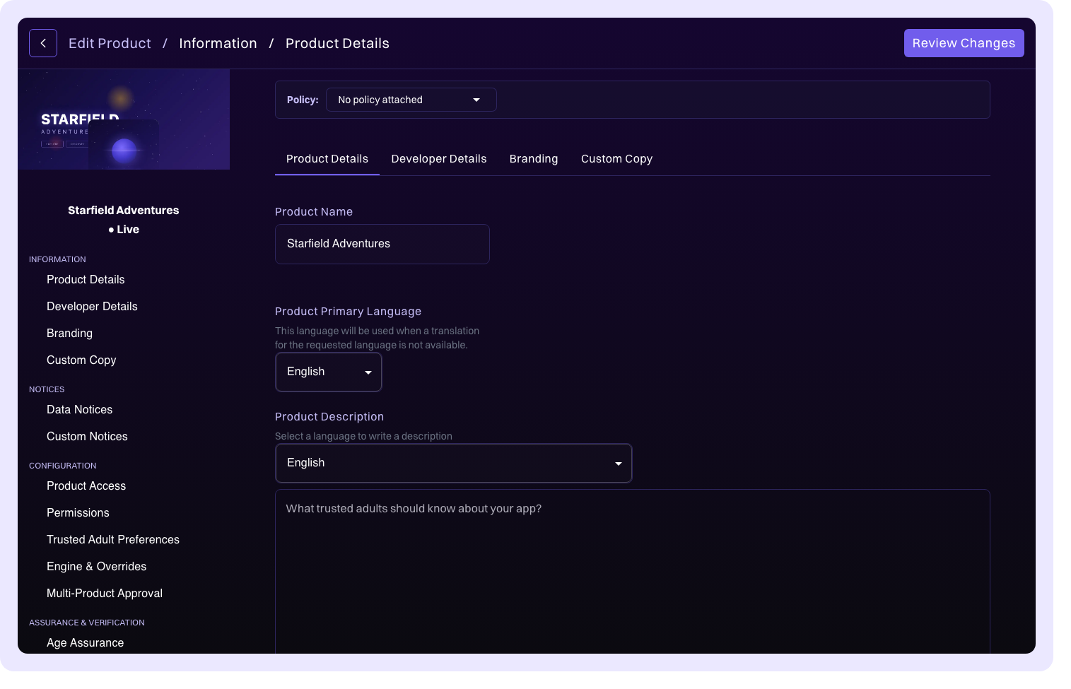
Product details
The product details section captures the core identifying information for your product.
| Field | Description |
|---|---|
| Product Name | The display name of your product, shown throughout Compliance Studio and in k-ID widgets. |
| Product Description | A description of your product. This can be localized into multiple languages to support your target markets. |
| Product Type | The category of your digital product (for example, game, app, website, platform). |
| Primary Language | The default language for your product's compliance content. |
| Account System Product | Toggle this on if your product uses an account system. See Account System Product for details on how this affects cross-product session management. |
Product image
Two images represent your product across Compliance Studio and k-ID surfaces:
- Logo: 512×512 pixels. Displayed as the product icon throughout the portal.
- Banner: 2430×810 pixels (a 3:1 aspect ratio). Displayed at the top of the product detail page and across k-ID surfaces.
Both images can be uploaded via drag-and-drop or by using the file picker.
Banner safe area
You upload a single 3:1 banner, but it renders at different aspect ratios depending on the surface and orientation. Each surface crops the image from the center:
| Surface | Rendered ratio | Crop behavior |
|---|---|---|
| Mobile portrait and desktop | 2:1 | Shows the middle of the image width; the left and right edges crop off. |
| Mobile landscape | 4:1 | Keeps the full width and shows the middle of the image height; the top and bottom edges crop off. |
Because the asset is cropped tall on some surfaces and wide on others, the only region guaranteed to stay visible everywhere is the central 60% of the upload: a 1458×486 pixel box centered on the 2430×810 banner. Keep faces, characters, logos, and any other critical content inside this safe area.

Treat the outer edges as overflow. Extend background art (sky, ground, particles, color wash) all the way to the edges so the cropped surfaces still look complete. In mobile landscape, only a centered window of the banner is shown sharp and the rest of the image is stretched behind it as a progressive blur, so make sure the edges of your artwork still look good when blurred.
- Center your key subject (face, character, wordmark) inside the central 60%.
- Extend background art to the full 2430×810 so the edges feed cleanly into crops and blur.
- Check that edge colors look good blurred.
- Place faces or logos in the outer 20% of the width or height.
- Bake text or calls to action into the banner; edges blur and the bottom can be overlaid by interface elements.
- Put critical detail near the top or bottom edge, which crops off in landscape.
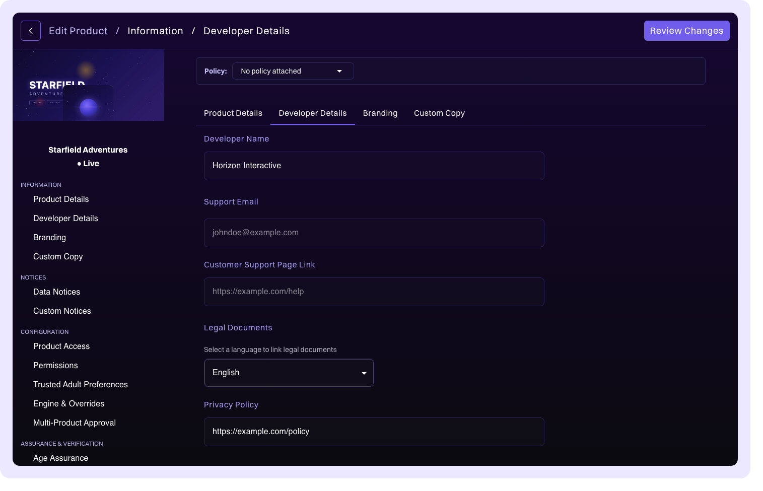
Developer details
Developer details provide contact information and legal links that are surfaced to users and parents through k-ID widgets and the Family Connect portal.
| Field | Description |
|---|---|
| Publisher Name | Your company or studio name. |
| Support Email | The customer support contact email displayed to users. |
| Privacy Policy URL | A link to your product's privacy policy. Can be localized into multiple languages. |
| Terms of Service URL | A link to your terms of service. Can be localized into multiple languages. |
| Customer Support URL | A link to your support or help page. |
Additional legal links
For products that operate across multiple platforms (for example, Xbox, PlayStation, PC), you can add platform-specific legal documents. Each additional legal link includes a Variant ID that can be used for platform targeting, allowing you to serve the correct legal documents based on which platform the user is accessing your product from.
Contact emails
Configure email recipients for different notification types. This ensures that compliance-related communications, review updates, and alerts reach the right team members.
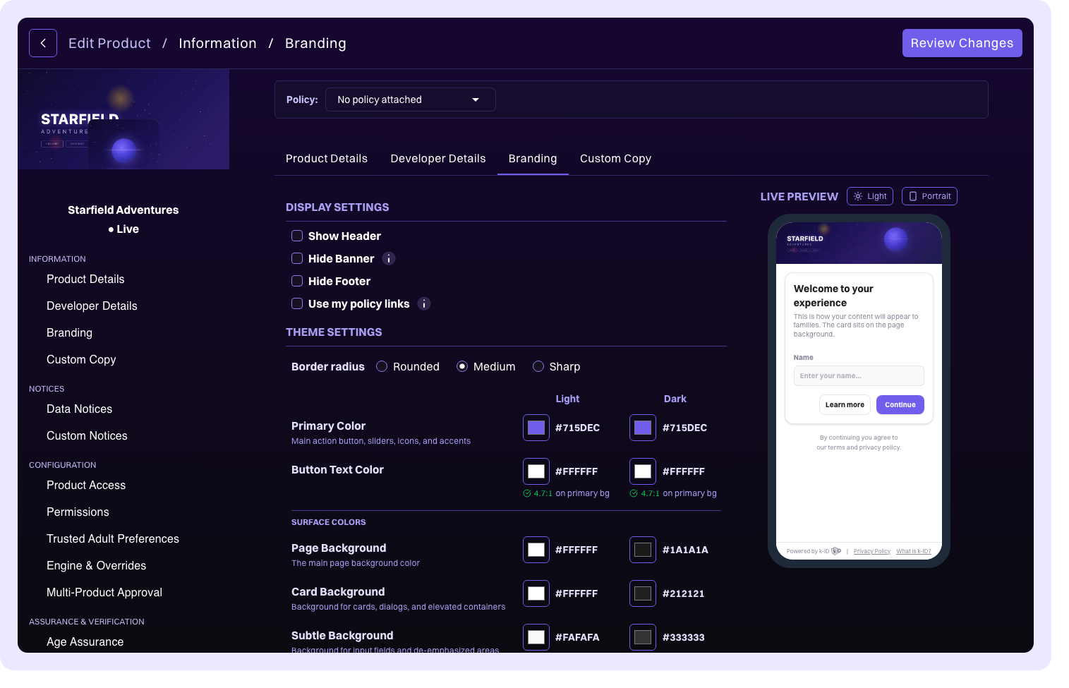
Branding
Customize the appearance of k-ID widgets that are displayed to your users during age gate, consent, and verification flows.
| Setting | Description |
|---|---|
| Widget theme and colors | Adjust the color scheme of k-ID widgets to match your product's visual identity. |
| Dark mode | Enable dark-themed widgets for your product. |
What is k-ID? button | Control whether the informational What is k-ID? button is displayed on widgets. Disabling this hides the button from all widget surfaces. |
| Use my policy links | Replace the default k-ID Privacy Policy and Terms of Service links in the widget footer with the URLs you configured in Developer details. When enabled, the Powered by k-ID branding is hidden. |
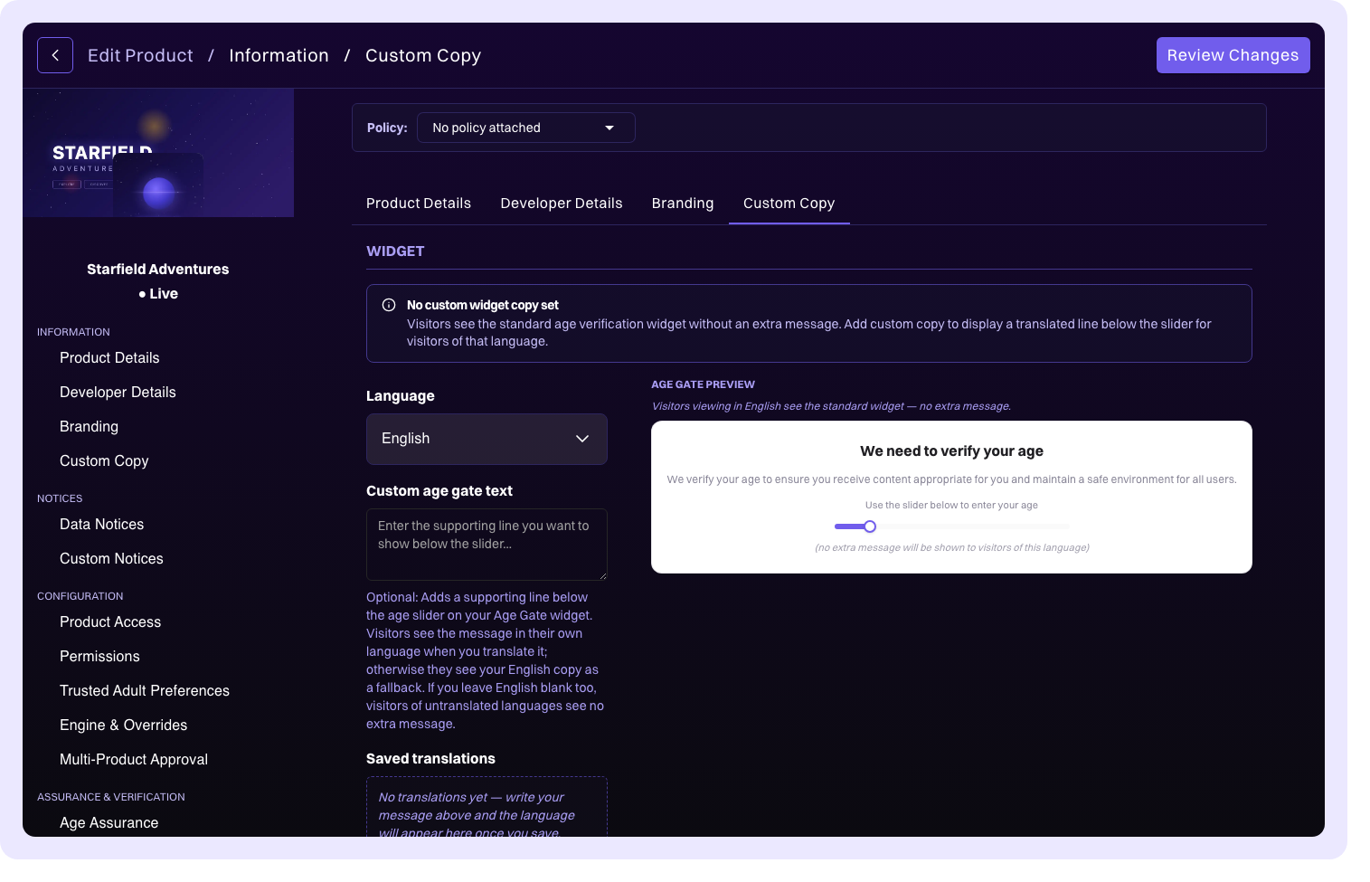
Custom copy
Override the default text and messaging displayed in k-ID widgets with your own wording. This lets you tailor the language to better match your product's voice and tone (for example, customizing the age gate prompt, consent request text, or verification instructions).